JSX
UIX has built-in support for JSX in .tsx files.
In UIX, JSX is used to create native DOM elements and components in a declarative way. JSX elements can be used interchangeably in both frontend and backend code.
Note
UIX uses a custom JSX flavor called JUSIX which allows writing reactive code in a less verbose way. In order for that to work, make sure to have the Deno for UIX selected as your Deno runtime.
Creating elements
All native DOM elements (e.g. <div>, <p>, <img>, <svg> …) can be created with JSX and used in your UIX application both on frontend and backend code.
const section = (
  <div id="section">
    <h1 style="font-weight: bold">Title</h1>
    <p>First Paragraph</p>
  </div>
);
In contrast to frameworks such as React, the value returned by above JSX expression is an actual instance of an HTML element (in this case section is an instance of HTMLDivElement.
This means that you can directly modify created elements using common DOM APIs to update attributes, attach event listeners, or change style or children. You can also append created elements to others, such as appending them directly to the document body:
const myElement = <p>Hello, UIX!</p>;
document.body.append(myElement);
Supported attributes
For default DOM elements, all attributes that are natively supported by the element can be used in UIX.
Components support the common DOM element attributes (such as id, class, style or event handlers) by default, and can accept additional custom attributes defined in the component class or function.
In UIX, you can define attributes directly on HTML elements. For example, the class attribute can be assigned a value as follows:
<div class="my-div">Hello, UIX!</div>;
You can use dynamic values within curly braces {} in your attributes. This allows you to pass variables or expressions into the element attributes:
const className = "my-div";

<div class={className}>Hello, UIX!</div>;
For setting inline styles, UIX allows the use of an object notation within the style attribute. This is done using double curly braces {{}} such as shown in the following example:
<div style={{ color: "red", backgroundColor: "yellow" }}>Styled Text</div>;
By default, common HTML attributes are type safe to use, if you want to define custom data attributes, you can use the data-* notation. This is useful for embedding custom data that can later be accessed via your applications code. For example:
const myArticle = {
  id: 42,
  title: "My article #1",
};

<h1 data-article={myArticle.id}>{myArticle.title}</h1>;
Reactivity
Thanks to DATEX, elements created with JSX are inherently reactive, even if they are not declared inside a component function like in React. JSX elements accept plain JavaScript values or DATEX Refs as attribute values and element children. Passing plain values does not dynamically update the component:
let myClass = "xyz";
const myDiv = <div class={myClass}>Hello, UIX!</div>;
myClass = "abc"; // myDiv class is still 'xyz'
To achieve reactive behavior, you can pass in a Ref value:
let myClass = $("xyz");
const myDiv = <div class={myClass}>Hello, UIX!</div>;
myClass.val = "abc"; // myDiv class is now 'abc'
Input attribute binding
To manage data binding between reactive Refs and input elements, we can use the attr, attr:in, and attr:out attributes for greater of data flow. These attributes allow for either bidirectional or unidirectional data binding, depending on the desired interaction between the Ref and the input.
Input reactivity works with native attributes such as value or checked for HTMLInputElement, HTMLTextAreaElement, and <select> elements.
Bidirectional binding (value)
By default, all attributes are reactive and updated bidirectionally.
This means that if the attribute value is a Ref, the attribute will be updated when the Ref value is changed externally, and the Ref value itself will be updated when the attribute is changed, e.g. by user interaction in an input field:
const inputText = $("Hello");

// add input element to the DOM
document.body.append(<input type="text" value={inputText} />);

// observe inputText changes, log every time the input value changes
observe(inputText, (val) => console.log("Text changed to: " + val));
Unidirectional binding (value:in)
You can opt for unidirectional data binding to restrict how changes flow between the input element and the Ref.
The value:in (respectively checked:in for checkbox inputs) attribute only binds the value of the input element to the reactive Ref. The flow of data is one-way: when the Ref is updated, the value of the input or textarea element is updated, but changes in the input field made by the user do not modify the Ref’s value.
const inputText = $("Hello");

// inputText updates will flow into the input field, but typing will not affect inputText
<input type="text" value:in={inputText} />;

inputText.val = "Hello, UIX!";
Unidirectional binding (value:out)
The value:out and (respectively checked:out for checkbox inputs) attribute binds the input element to the reactive Ref, but in this case, only changes from the input element will update the Ref’s value. Changes made to the Ref won’t reflect in the input field.
const inputText = $("Hello");

// typing in the input will update inputText, but changes to inputText will not reflect in the input field
<input type="text" value:out={inputText} />;
Radio inputs and value:selected
For radio inputs, there is a special attribute value:selected that is not directly bound to the value attribute of the radio input, but instead binds the value of the selected radio input to the Ref value.
When a specific radio input is selected, the Ref value is updated to the value of the selected radio input. Changes to the Ref value affect which radio input is selected.
Normally, value:selected is used in combination with a normal value or value:in attribute, which holds the actual value of the radio input:
const selectedValue = $("option_a");

export default (
  <div>
    <input
      type="radio"
      name="option"
      value="option_a"
      value:selected={selectedValue}
    />
    <input
      type="radio"
      name="option"
      value="option_b"
      value:selected={selectedValue}
    />
  </div>
);

// select the second radio input
selectedValue.val = "option_b";

// the observer is triggered when the selected radio input changes
observe(selectedValue, (val) => console.log("Selected value: " + val));
Reactive expressions
Instead of single values, you can also pass in reactive expressions as attribute values or children. Reactive expressions are automatically recalculated when one of the dependencies changes:
const radius = $(0);

<div>
  <h1>Circle Area Calculator</h1>
  <input type="number" placeholder="Radius" value={radius} />
  <p>Area = {Math.PI * radius ** 2}</p>
</div>;
Reactive expressions and custom components
When instantiating custom components, expressions inside an attribute are only reactive if the component explicitly
marks the attribute as reactive by wrapping it in a Ref type.
const count = $(0);

const StaticCounter = template<{ count: number }>((props) => (
  <div>
    <p>Count: {props.count}</p>
  </div>
));

// In this case, the expression {count * 10} is not reactive:
const staticCounter1 = <StaticCounter count={count * 10} />;

// ⚠️ If you try to pass a ref value directly into an attribute that is not marked as a reactive,
// you will get a type error:
const staticCounter2 = <StaticCounter count={count} />;

const ReactiveCounter = template<{ count: Ref<number> }>((props) => (
  <div>
    <p>Count: {props.count}</p>
  </div>
));

// In this case, the expression {count * 10} is reactive, sind the attribute is marked as a Ref:
const reactiveCounter = <ReactiveCounter count={count * 10} />;

// Directly passing a Ref value into an attribute is also possible:
const reactiveCounter2 = <ReactiveCounter count={count} />;
Note
Reactive expressions that evaluate to non-primitive values (e.g. objects or arrays) have only limited support in the current version of UIX. Try to avoid passing reactive expressions that evaluate to non-primitive values as attributes to custom components. Non-primitive values that are bound to a DATEX pointer and are inherently reactive, can still be used as (reactive) attribute values.
Conditional rendering
With conditional rendering, specific elements are only rendered if a certain condition is met. There are multiple ways to achieve conditional rendering with UIX.
Using ternary expressions
The simplest way to conditionally render elements is using ternary expressions:
const showDialog = $(false);
const myDiv = (
  <div>
    My Div
    {showDialog.val ? <div id="dialog">My Dialog</div> : null}
  </div>
);
Note that instead of showDialog, the current value of showDialog (showDialog.val) is used in the ternary expression.
Otherwise, the ternary operator would always render the element, even if the Ref value is false because the Ref object itself is always truthy.
Using the && operator
Alternatively, you can use the && operator to conditionally render elements:
const showDialog = $(false);
const myDiv = (
  <div>
    My Div
    {showDialog.val && <div id="dialog">My Dialog</div>}
  </div>
);
This is especially useful if you want to render an element only if a certain condition is met and you have no need for an else case.
Using toggle
With the toggle function, you can achieve the same effect as with the always function, but it is more efficient, because the return values are only every created once.
The toggle function toggles between two values, depending on another input condition (in this case, showDialog):
const showDialog = $(false);
const componentInstance = <MyComponent />;

const myDiv = (
  <div>
    My Div
    {toggle(
      showDialog, // input trigger property
      componentInstance, // rendered if showDialog is true
      <span>Nothing to show</span>, // rendered if showDialog is false
    )}
  </div>
);

showDialog.val = true;
If the value of showDialog is updated in the above example the of myDiv will toggle between componentInstance and the span depending if set to true or false.
Using the display style property
A different approach for conditional rendering is setting the display style property to a Ref:
const showDialog = $(false);
const myDiv = (
  <div>
    My Div
    <div id="dialog" style={{ display: showDialog }}>
      My Dialog
    </div>
  </div>
);
When showDialog is set to false, display is none and the div is not rendered.
Otherwise, display is block and the div is visible.
Rendering lists
To render a list of elements, you can use the map function on an array and map it to return an array of JSX elements:
const items = ["Item 1", "Item 2", "Item 3"];

<ul>
  {items.map((item) => (
    <li>{item}</li>
  ))}
</ul>;
This also works with reactive arrays:
const items = $(["Item 1", "Item 2", "Item 3"]);

const list = (
  <ul>
    {items.map((item) => (
      <li>{item}</li>
    ))}
  </ul>
);

// add an item to the list
items.push("Item 4");
You can use other array functions such as filter, reduce, forEach or find in the same way.
To map over other structures like Sets, which do not natively support the map method like Arrays, you can use the map function from DATEX to achieve a similar and reactive outcome. Pass the structure as the first argument, and the callback function for the transformation as the second argument.
const items = $(new Set());

const list = (
  <ul>
    {map(items, (item) => (
      <li>{item}</li>
    ))}
  </ul>
);

// add an item to the list
items.add("Item 4");
Reactive async expressions
Inside JSX expressions, it is also possible to call and await asynchronous functions.
const myAsyncFunction = async (userId: number) => {
  return await fetch("https://example.com/users/" + userId);
};

const myDiv = <div>User: {await myAsyncFunction(userId.val)}</div>;
Warning
Only values that are captured before or in the first await statement inside an expression are recorded as dependencies.
Changes to values that are captured after the first await statement are not tracked and will not trigger DOM updates.
Input validation
Input validation ensures that user inputs on HTMLInputElement or HTMLSelectElement meet the expected data requirements of their bound Ref.
Default input validation
In UIX, default input validation is automatically applied to both HTMLInputElement and HTMLSelectElement elements. This guarantees that the value bound to a Ref remains valid, even when a user attempts to enter invalid data, such as text in a numeric input field. Depending on the input type, the system enforces validation for formats like numbers or bigints to maintain consistent and reliable input data. For non-numeric inputs, UIX will cast the values appropriately (e.g. entering a number in a text field will still result in a text value).
const myValue = $(0);

<input type="number" value={myValue} />;
To disable the default input validation behaviour or change the validity message shown by the browser on invalid user input the defaultInputValidation of domUtils can be used:
import { domUtils } from "uix/app/dom-context.ts";

// Disable validation for <input type="number"/>
domUtils.defaultInputValidation.number.enabled = false;

// Override the validation message (depends on the browser)
domUtils.defaultInputValidation.bigint.message = "Why, just why?";
Custom input validation
In addition to default validation, UIX supports custom validation through assertion methods. These methods allow you to enforce specific rules for properties, such as requiring a Ref’s value to remain within a numeric range or ensuring that it has a specific length, format, or pattern — such as a valid email address.
Ref input validation
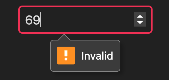
In the following example, we define a reactive Ref for a number input and ensure that its value is always less than 42 using the assert() method.
const myValue = $(0);
myValue.assert((val) => val < 42);

<input type="number" value={myValue} />;
If a user enters an invalid value — such as a number that doesn’t satisfy the validation rule (e.g. 69) — the input state becomes invalid, and the browser will display an error message.
You can enhance and customize this behavior using defaultInputValidation, which provides more control over how validation errors are presented to the user.
To display custom assertion messages for invalid states, the assert method and decorator allow returning strings to be displayed as error messages:
assert((val) => val < 42 || "Not in range!");
Class component input validation
You can use the @assert decorator to apply custom validation logic to your Class component’s reactive instance properties. This allows you to enforce specific rules by providing a callback function that acts as the assertion. Here’s an example:
import { template, Component } from "uix/components/Component.ts";

@template(function () {
  return <input type="text" value={this.myEmail} />;
})
class MyForm extends Component {
  @assert((val) => /\S+@\S+\.\S+/.test(val))
  @property
  myEmail = "max@unyt.org";
}
Special attributes values
Each attribute value can be set to a DATEX pointer. When the pointer value changes, the attribute is updated accordingly.
Some attributes support special values that act as helpers to allow for easier modification, such as event handlers, style or class.
Event handlers
All event listener attributes such as onclick, onfocus, or oninput can take a callback function as value:
const btnDisabled = $(false);
<div>
  <button disabled={btnDisabled}>Submit</button>
  <button onclick={() => (btnDisabled.val = false)}>Enable</button>
  <button onclick={() => (btnDisabled.val = true)}>Disable</button>
</div>;
Style
The style attribute accepts a string or an JavaScript object with style declarations. The style properties can be pointer values to allow for reactive updates:
<div style={{ color: "blue", padding: "10px" }} />;
const borderWidth = $(0);

// increase border width every second
setInterval(() => borderWidth.val++, 1000);

<div style={{ borderStyle: "solid", borderWidth }}>Hello, UIX!</div>;
Most style properties accept only string values. However, UIX allows special shortcuts for some CSS properties. The following style properties also take other values:
display- The display property accepts abooleanvalue. If the value istrue, thedisplayproperty is set to the default display value (e.g.display: blockfor a div). If the value isfalse,displayis set tonone.
Scoped stylesheets
The special stylesheet attribute can be used on JSX elements to apply a whole CSS stylesheet to the scope of the element (See Element-scoped styles).
Class
Similar to the style' attribute, the class’ attribute takes a string or an object.
The object must contain the potential class names as properties and booleans as corresponding values, indicating whether this class should be set or not.
Simple class string:
<div class="main big" />;
Simple array list:
const myClasses = ["main", "big"];
<div class={myClasses} />;
Reactive class object:
const enableBig = $(false);
<div class={{ main: true, big: enableBig }} />; // class is set to "main"

// ...
enableBig.val = true; // class is now "main big"
Paths
All attributes that accept a path as a value (e.g. src and href) can be set to paths relative to the current module (For additional information check out uix-module in Supported Attributes).
Relative paths in element attributes are always resolved correctly on the backend and on the frontend.
export default { "/img1": <img href="../common/images/1.png" />, // file is in common directory: can be resolved on the frontend "/img2": <img href="./res/images/2.png" />, // file is in backend directory: only accessible on the backend, not available on the frontend! };
export default { "/img3": <img href="../common/images/3.png" />, // file is in common directory: can be resolved on the frontend "/img4": <img href="./res/images/4.png" />, // file is in frontend directory: accessible on the frontend };
You can use the special href:route attribute if you need paths that are relative to the current URL as displayed in the browser:
export default { "/some/path": <a href:route="./other-path" />, // resolves to '/some/other-path' "/some/other-path": "Hello there", };
Instead of assigning string values, the URL object can also be set as path attribute.
Checkbox checked attribute
The special checked attribute of a checkbox element can be used to set or get the checked state of a checkbox:
const isChecked = $(false); // Bind the 'checked' state of the checkbox to the isChecked pointer export default <input type="checkbox" checked={isChecked} />; // Observe the pointer isChecked.observe((checked) => console.log("checkbox is checked: " + checked));
Form actions
The action attribute of a <form> element can be an URL or string containing the URL of the form request, or a callback function that is triggered on submit.
The return value of that function is rendered on the page and must be a valid Entrypoint value (e.g. an HTML element, a string or a Response object).
// this function gets called when the form is submitted function handleForm(ctx: Entrypoint) { // ... return "Form submitted"; } export default <form action={handleForm}> <input type="text" name="username"/> <input type="password" name="password"> <button type="submit">Login</button> </form>
Other UIX-specific attributes
There are a few special attributes for UIX-specific functionality:
uix-module- specify the module path which is used as a reference for relative paths, e.g.:
This is only required for compatibility with Safari. In other runtime environments (e.g. Deno), the<img uix-module={import.meta.url} src="./relative/path/from/current/module/image.png" />;import.meta.urlis always automatically inferred and does not have to be explicitly set.datex-pointer- A boolean set to true if the element should be bound to a pointer. Pointers are automatically created for elements that are sent over DATEX. By default, only class components are automatically bound to a pointer.uix-title- A string that can be set on a JSX Element to override the title and description meta tags in the<head>section of the DOM and auto generate OpenGraph meta tags.
Creating components
Components defined with functions or component classes can also be instantiated with JSX. In addition to the common DOM element attributes, all component options can also be set via type-safe JSX attributes if defined so:
<MyComponent style="color:green" myParameter="Hello UIX!" />;
Fragments
Fragments represent a minimal document object that has no parent. There are two ways to use fragments within UIX.
DocumentFragments
You can create HTML DocumentFragments using the <></>-fragment tags:
<>
  <div>Content 1</div>
  <div>Content 2</div>
</>;
This is equivalent to
<DocumentFragment>
  <div>Content 1</div>
  <div>Content 2</div>
</DocumentFragment>;
A fragment is collapsed into its child elements when appended to another DOM element.
Note
Keep in mind that native DocumentFragments are not reusable. This means that after a fragment was appended to another element, it no longer has any content. If you want to directly return a top-level fragment for an entrypoint, you should always return it from a function, not as a single instantiation:
export default <>Content</>; // Don't do this
export default () => <>Content</>; // This is correct
Alternatively, you can use the uix-fragment element.
UIXFragments
A uix-fragment is a reusable fragment that is part of the actual DOM but is never rendered itself. All of it’s children are visible in the DOM. It can be instantiated like this:
<uix-fragment>
  <div>Content 1</div>
  <div>Content 2</div>
</uix-fragment>;
UIX Fragments do not face the reusablity issues of DocumentFragments, but you need to keep in mind that they are always visible to CSS selectors:
<div> <uix-fragment> <h1>Title</h1> </uix-fragment> </div>;
div > h1 { /* this does not work */ } div h1 { /* this works */ } div > uix-fragment > h1 { /* this also works */ }
Using HTML template strings
As an alternative to JSX, you can also use the HTML template string function which provides exactly the same functionality as JSX:
This is how we would do it in JSX:
const count = $(0);
const div = (
  <div>
    <p>Count: {count}</p>
  </div>
) as HTMLDivElement;
If we don’t want to use JSX, we can treat the DOM as template string and pass it to the HTML helper function:
const count = $(0);
const div = HTML`
    <div>
        <p>Count: ${count}</p>
    </div>` as HTMLDivElement;
In contrast to JSX, the HTML function does not require an extra transpiler step and can also be used in plain .js files.
DATEX injections
Besides JavaScript injections (with ${}), the HTML function also supports reactive DATEX code injections with the #() syntax:
const count = $(0);
const div = HTML`<div>next count: #(${count} + 1)</div>`;
The expression inside #() is always handled as a transform function that results in a new reactive pointer value.
This is equivalent to a JavaScript always() transform function
const div = HTML`<div>next count: ${always(() => count + 1)}</div>`;
or a DATEX always command
const div = HTML`<div>next count: ${always`${count} + 1`}</div>`;
Element return types
TypeScript has no support for dynamic return types for JSX declarations.
As a result, all JSX-generated elements must be explicitly cast to the correct class for proper HTML type handling. The same applies to elements created with the HTML helper function.
const anchor = (<a href="/link">Link</a>) as HTMLAnchorElement;
const anchor = HTML`<a href="/link">Link</a>` as HTMLAnchorElement;
Help us improving our docs
Our documentations are fully open source. Something is wrong or unclear?